By: Sahin Guvenilir
Data, a set of raw figures and facts that can help us make better decisions sooner. However, when it’s misused it can come with many risks. So, how should we make sure to not be fooled by data?
As emphasised by renowned risk and probability scholar Nassim Nicholas Taleb, the calamity of the information age is that the toxicity of data can increase faster than its benefits (Taleb, N 2016, The Bed of Procrustes, Penguin). Because, rushing to conclusions with too many unvalidated assumptions may result in measuring wrong things, perverse incentives, creating waste, and decreasing return of investment.
An example of measuring and incentivising wrong things can be seen in a historical occurrence in Delhi, India, when the government offered a reward for every dead cobra to decrease the number of venomous snakes in the wild, and inadvertently encouraged people to establish cobra farms to generate more income (see. Cobra Effect). This is a demonstration of how the way we use data and what we measure drive human behaviours.

Supporting more than one hundred teams throughout my career has convinced me that the fine line between weaponising data and using it for achieving better outcomes is still determined by the intention of its user. However, even someone with good intentions may still struggle to turn data into useful information due to various reasons, including, but not limited to, bias, echo chambers and lack of knowledge about the context.
The good news is that there are certain things we can do to generate more helpful dialogues around how to interpret data and use it to make better decisions. Understanding the difference between causality and correlation is one of them.
Understand the difference between causality and correlation
To begin with, confusing causality with correlation is one of the most common data interpretation anti-patterns. The “correlation implies causation” approach is an example of a questionable-cause logical fallacy. Correlation does not always imply causation.
Otherwise, we could assert that every time Nicholas Cage plays in a movie, it causes pool drownings. Vice versa. At least the data on the graph below support this idea.
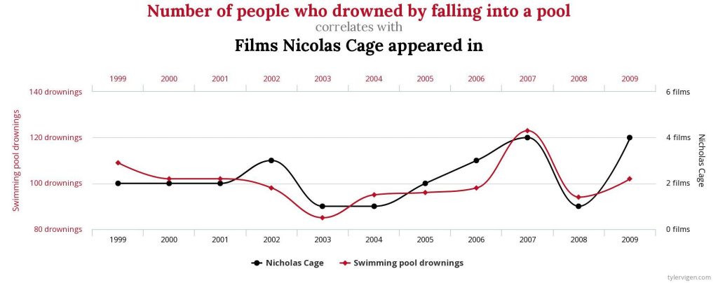
Centers for Disease Control & Prevention and Internet Movie Database, tylervigen.com
This is utterly random, and not helpful.
The same pattern applies to the relationship between the number of ice cream sales and forest fires. Although this time they have a correlation point (both increase during summer, naturally), they still do not have a cause-effect relationship, and it would be unreasonable to say “we should ban ice creams because they cause forest fires”.
Tell the difference between facts and vanity metrics
To look at it in the real world context, think about a manager comparing the velocity of multiple Scrum Teams to figure out which ones are delivering value and which ones are failing.
In reality, velocity indicates the distance that can be covered by the Scrum Team on the Product Backlog in a time period; that might be a Sprint or an anticipated milestone. In the Sprint Planning, it can help the developers sense how much is achievable, and allow the Product Owner to plan her roadmap better.*
Nevertheless, velocity doesn’t provide any meaningful information around whether the Scrum Team delivers value or not. This can only be understood through a mix of outcome-focused measures such as ROI (Return of Investment), customer satisfaction, product usage index, et cetera. It also doesn’t necessarily provide a data point about the quality of the work delivered.

On the other side of the coin, we often see that the experienced teams that continuously deliver value for their customers have a good flow, high output, hence an impressive velocity. Unfortunately, using deductive reasoning based on this phenomenon can easily let us down:
“All high performing teams have a good velocity. Team A has a good velocity. So, Team A is a high performing team”
Not necessarily.
Velocity may provide circumstantial evidence about the team’s ability to deliver outputs. Does it help them improve customer satisfaction? Does it help them increase their revenue? Can a team with a lower velocity deliver more value and perform better than another team with a higher velocity? It’s better to start with these questions and focus on factual evidence.
* Contrary to popular belief, velocity doesn’t have to be in story points. For instance, the team may prefer using item counts/throughputs instead of relative estimation.
Escaped Defects… Are they though?
In the mid-2010s, I was helping a B2B technology company that builds financial products. After several complaints from the client about the quality of the latest increment, The Program Manager was keen to collect data around the ‘escaped defect’ trends. An escaped defect was defined as an unexpected behaviour of the product that can be observed by the customer in the production environment (or any target environment owned by the client).
As can be imagined, the fingers pointed out the engineering teams straightaway since they were accountable for the quality of the features delivered. This idea was legitimatised by some impressive power-point slides and meticulously produced graphs that show the increasing trend of escaped defects in the last few releases.

After a few extremely tense cross-team level Daily Scrums that week, we sat together with a few volunteers to deep dive and see what lies behind this data. The result was revealing. Approximately 85% of the problems identified as escaped defects were not even ‘escaped defects’ but ‘misunderstood customer problems’. Simply, the teams had delivered high-quality items. But, not the ones needed by the client.
So, the problem was beyond ‘poor engineering practices’. The cause-effect diagram below (remember, all models are wrong, but some of them are useful) roughly reflects the insights we generated about what may have actually happened.
We realised that the number of layers/middle-managers between the client and the engineers disrupted the value stream. People who had the problem weren’t talking to the ones who were supposed to solve it. It forced engineers to make too many assumptions about the desired outcomes. They had to chase the layer positions, that were functioning like account managers between the client and them, to clarify the requirements. And it wasn’t always successful. From time to time, they ended up being disconnected from what the client actually needed.
It shouldn’t be too hard to predict this pattern also brought various cognitive capacity problems and context-switching issues that reduced the time available to craft clean code. Less clean code paved the way for more defects and a codebase that is more expensive to maintain and change.
All in all, this vicious cycle led to unhappy customers and frustrated employees, which was going to manifest itself as increased employee turnover in the next few months.
So, Where to Start?
I believe one of the biggest challenges to tackle for a change agent is to encourage people to think for themselves and say goodbye to the ‘everything should have a best practice’ approach, including how to interpret data and what to measure.
Having said that, there are those who think the data rules below are important to consider for harnessing change to gain competitive advantage:
- Incomplete data are better than no data at all
- Recent data are better than older data
- Relevant data are better than more data
- Shorter-term forecasts are better than the longer-term ones
- Updating your forecast as you learn is better than sticking to a plan
The approach below helped the organisations, teams and people I supported in the past in terms of focusing on the intention and the outcomes over vanity metrics:
- Have a clear Strategic Goal that is specific, aspirational and measurable: Send a human on the moon, and safely return her/him back before the end of this decade.
- Determine the Intermediate Goal that would validate your progress against your Strategic Goal: Put a human into orbit and return her/him back safely to the earth.
- Create an experiment loop to work on Tactical Goals that would get you closer to your Intermediate Goal: Test a new engine.
- Define the measures for each level of goals, not to reward or punish, but to make better decisions sooner and navigate quicker with a better return of investment.
- Inspect and adapt!
As Goodhart’s Law asserts ‘When a measure becomes a target, it ceases to be a good measure’. So, focus on the direction, use data to make better decisions, and generate more value sooner in your journey. Otherwise, we may end up turning measures into targets, and that can encourage people to open more cobra farms.
Read Sahin Guvenilir’s previous blog here:
Find out more from the author here.
WANT TO KNOW MORE ABOUT HOW S&S CAN HELP YOU AND YOUR ORGANISATION?
– Sign up to our fortnightly newsletter The Pulse with cutting edge business insights from our experts
– If you’re a senior leader or change agent, join one of our change communities to network and share with like-minded individuals
– If you have a problem that needs solving across business change, agility, leadership or transformation and you don’t want to go down the big, traditional consulting route-